
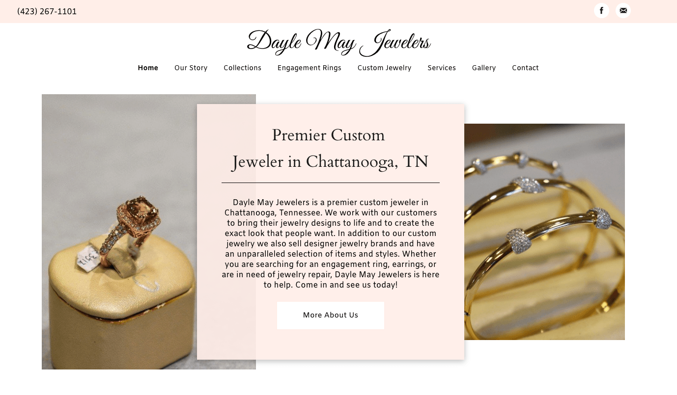
7 WEBSITE TRENDS TO KEEP AN EYE OUT FOR
Fancy Scrolling? Hamburgers? Whatcha' talkin' bout Willis?
1. Parallax Scrolling
Recently a customer told me that he knew a website was current if the site had the “images that move across the screen when you scroll”. I hadn’t thought of it quite that way, yet he did have a point. Though no one seems to know the actual term for it, Parallax scrolling is when the background images of the website move at a slower rate to the foreground, creating a 3D effect as you scroll. When used sparingly - (keyword -- sparingly) the design trend creates an element of depth that makes the foreground stand out.
Though Parallax Scrolling doesn’t directly drive website visitors to fill out forms or make calls or purchases, it is beneficial because it creates a smoother, more visually appealing site experience. As a result, users are more likely to stay on the site and engage with the content. Ultimately this will increase the likelihood that a person will make a purchase, fill out a form or take further action.

2. Large Imagery
We live in an increasingly visual world. Pictures and images capture the visitor’s attention and draw them into your site. The more appealing the images the more willing people will be to invest their time on your page.
Bold imagery and large, attractive headers allow the user to feel the experience of the site in a way that smaller images and chunky text would not. There is nothing as relatable as a photograph, and a powerful one at the top of a page can stir emotion and drive visitors further into your site.
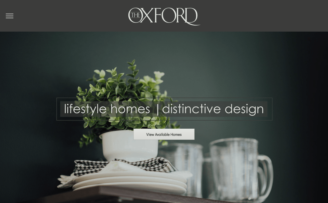
3. Hamburger Navigation

It kind of looks like a hamburger, right? Over the years, the hamburger, or side menu, has taken a lot of slack. The idea is that the three skinny lines in the upper right or left of the desktop screen preserve space that an otherwise thick navigation bar at the top of the site would not. On the negative side, some say the hamburger menu disappears in site design and many users don’t click on it or don’t know what it is. I understand this argument and that the hamburger menu would not be the right choice for certain demographics, but in G.T. Issa’s case, it worked perfectly.
G.T. Issa builds beautiful homes and when they came to us specifically wanting a side menu in their site build, I was all for it. This was an excellent way to display their work without taking away any screen space. This menu style is sleek, discreet, and is a great menu option for the right client, targeting the right demographic.
4. Intentional Font Pairings
Remember back in the day when a website would load and all you'd see are a set of funky letters and symbols? Your web browser sometimes had trouble recognizing new fonts. Well, folks such as Adobe and Google have made it pretty dang easy to incorporate new fonts with flavor to your website design.
However, determining fonts that pair well together can be a daunting task, but when done correctly can actually create a more powerful user experience and boost site traffic and conversions.
So ditch the traditional web fonts and find something that says more about who you are.
5. Minimalism
Minimalism is a popular modern design approach that can be achieved in more ways that a Squarespace template. Minimalism is simplifying the site by removing unnecessary elements. Keep an eye out for hidden navigation, empty space, no extra details, font experimentation and no extra buttons. In other words: create more by creating less.
6. Video Backgrounds
Video backgrounds are one of the most popular website designs around. Digital Marketers love large video backgrounds that make sites look engaging and modern in a way that large imagery cannot. Many experts say that visitors stay on sites with video backgrounds longer and are more likely to sign up for their services or opt-in to their products.

7. Overlapping Elements
Overlapping webpage elements is an excellent way to break out of the norm. Designers are constantly running away from the grid and content block design and running to the flexible, fluid, and engaging style of overlapping and offsetting elements. Most commonly used is the text that slightly overlaps an image.
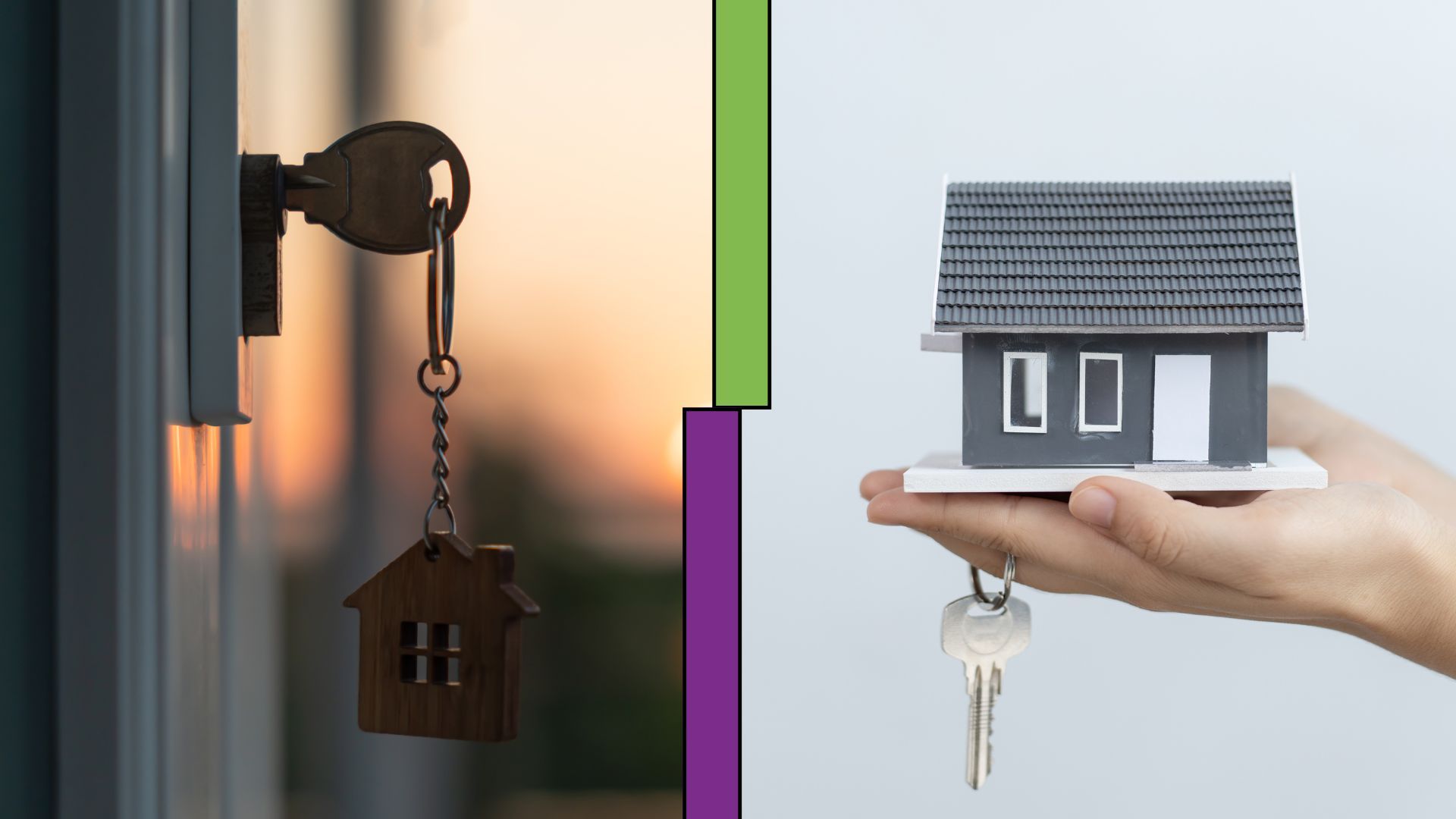
Two property management companies in Arkansas took unique approaches to digital marketing. One focused on maintaining a simple online presence, while the other utilized a comprehensive, data-driven strategy with a range of digital marketing services.
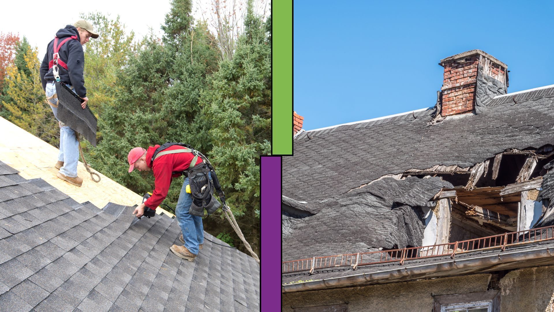
This case study compares two roofing companies—one leveraging multiple Flypaper services and another relying only on a website. The results highlight the impact of a full-scale marketing strategy.
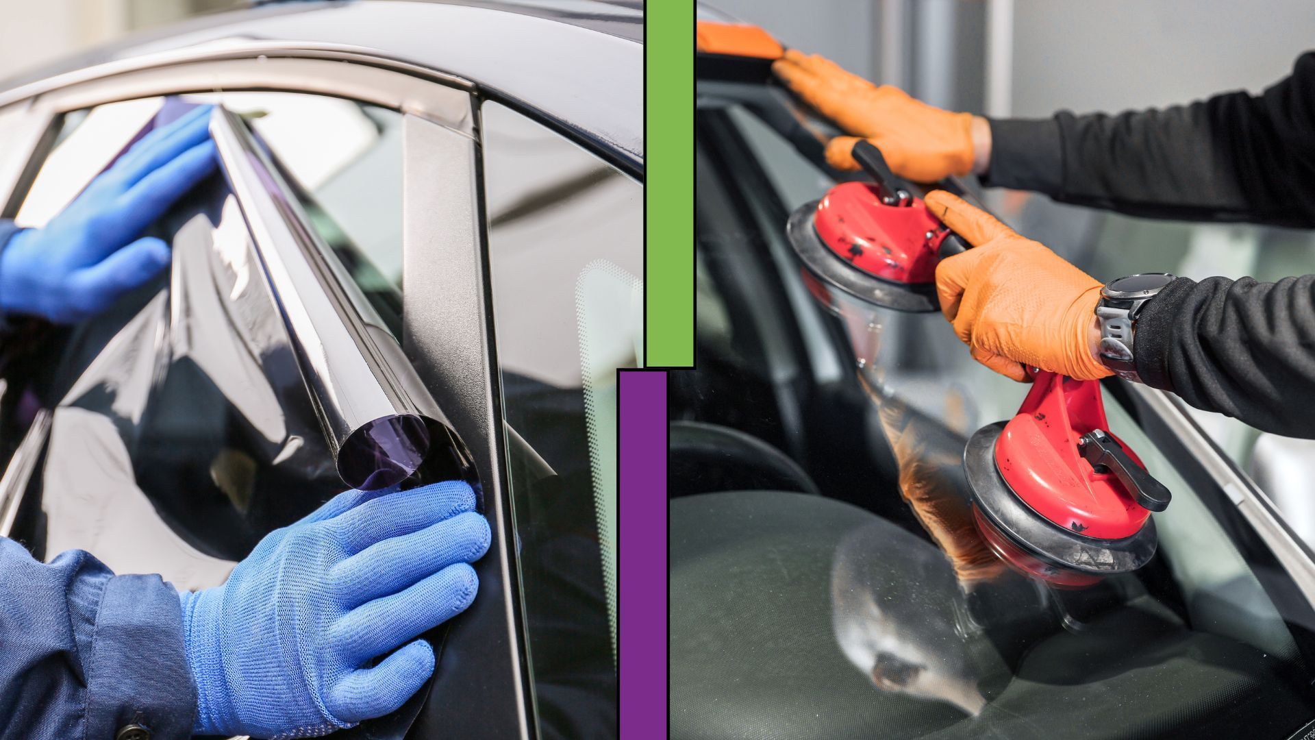
Having an online presence is just the beginning. This case study compares two Arkansas-based auto glass companies—to illustrate the difference between using a full-suite digital marketing strategy and relying solely on website hosting.

Two med spas took different approaches to their digital marketing. While one relied solely on online presence, the other invested in multiple Flypaper services. This case study explores how their strategies influenced growth, customer engagement, and overall performance.
Choosing the right digital marketing strategy is key to business growth. This case study compares a website-only client to one using multiple Flypaper services—showing the real impact of a full-scale approach.

Google’s search landscape is evolving, and with the rise of its Search Generative Experience (SGE), businesses need to rethink their SEO strategies. Unlike traditional search, which ranks results based on keywords, SGE harnesses AI to understand search intent, delivering direct answers, summaries, and interactive guides. The shift is significant, and businesses that adapt will be the ones who maintain visibility in this new search environment.
